
“Identity theft is not a joke, Jim!” — Dwight Schrute
You may not intentionally be stealing the identity of other home care agencies, but falling into the industry brand trap can certainly make it seem that way.
In a crowded home care market, blending in is one of the fastest ways to lose trust, attention, and ultimately clients. Most agencies aren’t trying to be a carbon copy of the competition down the street — they just want to look “professional.” But somewhere between the stock photo library and the safe, industry-approved color palette, a lot of agencies end up looking, sounding, and feeling like clones of one another. If a family can’t tell your brand apart from the next tab open in their browser, they’ll pick based on price or convenience instead of connection — and that’s a tough way to compete.
Here are three common (and very forgivable) marketing mistakes that turn home care agencies into brand doppelgängers — and how to break free of the lineup. 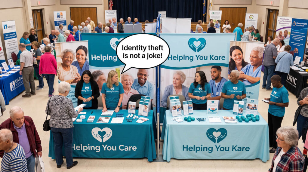
1. Using Visuals That Are Basically a Costume of Someone Else’s Brand
“Visuals” go far beyond photos — they include your logo, iconography, and overall design. And yet, across home care websites, social posts, and brochures, it’s like everyone shopped the same clearance rack. The same soft blue everywhere. The same heart-and-helping-hand combination in the icon that’s been recycled since the dawn of Comic Sans. The same stock photo of a suspiciously cheerful caregiver helping an equally suspiciously cheerful senior pour orange juice in a kitchen that was rented for the day to do a photoshoot somewhere in East Europe.
This is a branding problem dressed up as a safety net. When your logo, icons, and imagery all mirror the industry norm, your agency becomes visually interchangeable with dozens of others — a background character in your own story. Even if your care is exceptional, a brand identity trapped behind industry norms gives families nothing to remember you by. Generic industry icons and templated logos feel safe, but “safe” and “forgettable” are roommates.
Instead, aim for visuals rooted in purpose and identity — the kind that couldn’t believably belong to the agency two towns over. Choose logo symbols and branded icons that reflect something specific about your agency: your values, your story, your local community, that one detail that’s undeniably, unmistakably you.
Photography is where the impersonation becomes most obvious. Many agencies reach for the exact same stock images, and families can smell “staged” from a mile away, even if they can’t quite name why something feels off. At best, prioritize real photos of your actual caregivers and clients (with permission) in your actual environment. If that’s not immediately possible, work with local people as models — real neighbors beat rented smiles every time.
Another increasingly effective option is high-quality, paid AI image generation tailored to reflect your local community and clientele. Compared to generic stock libraries, AI-generated images can be shaped to feel relevant and specific to your market rather than mass-produced. The goal either way is the same: nothing that looks like it was cloned from a template — just a visual presence that feels real, local, and unmistakably yours.
AI imagery tip:
Be incredibly descriptive. The quality of the prompt you enter will ultimately determine the quality of the image on the other side. Here’s an example of a prompt I would use to illustrate a caregiver helping with meal preparation for a client based on the following understandings of an agency: 
- Agency is located in Dallas, TX
- Most caregivers are Hispanic or Black
- Brand colors are medium blue and an orange-ish gold
- Scrubs are typically medium blue or indigo blue
Generate a tall image (1080 px wide by 1920 px tall) of a caregiver (Hispanic, female, early-20s, wearing dark, indigo-blue scrubs) standing at a kitchen island preparing a heart-healthy meal for a senior (male, African-American, early-80s) who is sitting on a high-backed bar-stool on the opposite side of the kitchen island together. They are both talking as the caregiver prepares the meal. The home is typical of an older home in Dallas, TX and has a mix of older and more modern furnishings.
This image is the result of the prompt.
2. Picking a Name That Could Belong to Ten Other Agencies
Open a phone book… scratch that – go to Google Maps and search for home care in nearly any city, and you’ll find a suspicious number of businesses with the words “Caregiver”, “Health”, “Companion”, “Assistance”, “Services”, “Comfort”, “Compassion”, “Heart”, “Premier”, or “Senior” running around like they’re all cousins at the same family reunion. Fair enough — the franchises staked their claim early. But plenty of independents borrow all or part of those same names, then bolt on the ever-generic “Home Care” for good measure. The result is a name lineup so similar, a family could not pick you out in a police lineup, let alone remember you a week later.
Naming after the obvious “what you do” feels safe, but safe names lack distinctiveness. When families compare options, these names blur together into one warm, forgettable blob, making it harder for them to remember who you actually are.
A strong name should be both clear and memorable — not a Mad Lib built from the same five industry words everyone else picked. It can reflect your local roots, your founding story, or a specific philosophy of care. An agency rooted in Maine, for instance, might lean into regional identity or values that genuinely resonate locally, rather than reaching for the nearest generic noun.
If your name sounds like it could belong to ten other agencies in your area, that’s your cue to differentiate — before a family mixes you up with your competitor at the worst possible moment. Even a subtle shift in wording or a strong tagline can be the difference between “which one were you again?” and “oh, I remember you.”
Let’s stick with Maine for a bit and workshop a unique name, starting with some character traits that could be associated with a home care brand:
- Resilient
- Devoted
- Expressive
- Locally-rooted
After considering things that are tied to Maine that could be considered for an icon that relates with those terms, I landed on the Cardinal.
Then, I did a search for home care companies that use a Cardinal, and only found one in Fairfax, VA. We’ll assume for now that the business is only going to stay in Maine for this exercise. (If you plan to become multi-state or enter the franchising world, you’d want to consider a different brand name.)
While the bird shares the characteristics listed for the brand, the word “cardinal” also can also mean “primary” or “most important”. All great terms when striving to make connections with prospective clients and their families.
Now, to make a memorable logo anchored in the brand.

3. Writing Messaging That Sounds Suspiciously Familiar
Phrases like “We provide compassionate, high-quality care” or “Your loved ones are our top priority” show up on nearly every home care website — practically word for word, like everyone got the same group text. While these statements are true and well-intentioned, they’re also vague enough to describe literally any agency, anywhere, ever.
The issue isn’t that the claims are false — it’s that they’re not specific. Families are looking for a reason to trust you over the agency they just glossed past in the previous tab and the one they’re about to head to in the next tab – unless you connect with them. Generic language doesn’t give them anything concrete to hold onto. It’s the messaging equivalent of a stock photo: technically fine, emotionally forgettable.
Instead, lean into specificity and storytelling. Meet them where they are in their experience from their perspective. Don’t create another overwhelming situation by offering up technical, caregiver textbook content. Show your compassion by empathizing with their situation, then guide them solutions they could turn to for a different experience. Share real scenarios or outcomes that demonstrate your approach in action rather than describing it in the abstract. Provide testimonials and reviews to offer hope of an experience they can have.
For example, instead of “We provide dementia care,” followed by a bullet list try (this is an abridged version of a Solutions-Based Marketing Framework that helps write connective content):
Families who have a loved one with dementia often struggle with them as what was once simple becomes challenging…. (expound)…
You may have tried ________ with results for a time, but the progress of dementia is either making _______ no longer effective, or other challenges are adding on to the point where you and others can no longer provide the care needed.
You’re not alone in this. Other families we’ve worked with have shared ______________ after caregivers began working with them.
Before You Change Anything, Get Clear on This
Standing out in the home care industry doesn’t require flashy marketing — it requires clarity, authenticity, and a healthy refusal to dress like everybody else at the dance. When your visuals are real, your name is memorable, and your messaging is specific, you give families a reason to choose you for more than just convenience — and nobody mistakes you for the agency down the street.
So where do you start? Before you touch a logo file, rename anything, or rewrite a single headline, sit down and get honest about two things: your Brand Personality and your Right-Fit Clients.
Brand Personality is the character your agency would have if it walked into a room — warm and folksy, or polished and clinical? Faith-driven, family-run, no-nonsense? Right-Fit Clients are the families you actually want to serve and serve best — not “anyone who needs care,” but the specific people whose values, needs, and expectations line up with how you operate. Nail down those two things on paper, in plain language, and suddenly every other decision gets easier: which photos actually look like you, whether your name still fits, and what your messaging should say instead of the usual “compassionate, high-quality care.” You can’t be intentional about your visuals, your name, or your words until you’re clear on who you are and who you’re for — so start there, and let everything else follow.